Background
OECD’s BEPS project Action 13 provides a template for multinational enterprises (“MNEs”) to report annually and for each tax jurisdiction in which they do business the information set out therein. This report is called the Country-by-Country Report (“CBCR”). The CBCR template requires two tables of MNEs’ financial and operational information.
Exploratory data analysis
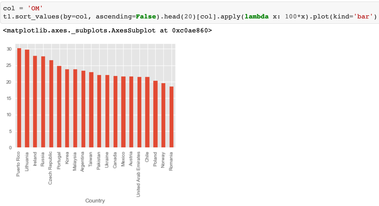
In the first year of submitting CBCR, I wanted to use Python instead of Excel to see how one may get more insights from the data collected in CBCR. There are obvious measures to be constructed, such as productivity per employee using PBT over the number of employees or related vs. unrelated revenue generated by capital. In Python, it feels much lighter and cleaner. For example, to construct and plot the operating margin in ascending order was just one line of code:
Another example is using the heatmap function in Python to have a high-level visual understanding of the relationships between each data attribute within the CBCR.

Each square shows the correlation between the data attributes on each axis. Correlation ranges from -1 to +1. Values closer to zero mean there is no linear trend between the two attributes. The closer to 1/-1 the correlation is, the more positively/negatively correlated the variables are. The diagonals are all 1/dark purple because those squares are correlating each data attribute to itself (so it’s a perfect correlation). For the rest, the larger the number and darker the colour the higher the correlation between the two attributes, e.g., ‘tangible assets’ here is shown to be highly positively correlated to ‘unrelated parties revenue’ (very dark purple).
A step deeper
The exploratory analyses would only provide linear views on each of the data attributes per se. I wonder if there’s a way to use publicly available data to construct any anomalies across the countries as an indicator of tax risks. Given OECD stated other sources of data could be considered, I brought in an additional data source – country headline corporation tax rate, and constructed a new measure called ‘tax elasticity’ to compare country tax payments.
tax elasticity = effective tax rate / country headline corporation tax rate
Where effective tax rate is calculated by tax paid/profit before tax. Tax elasticity provides an indicator of how much tax was paid effectively, on a scale of 0 to 1. Smaller tax elasticity may indicate there was active tax planning, such as loss carried forward. By overlaying this information with another financial KPI, such as operating margin, we obtain some interesting insights.
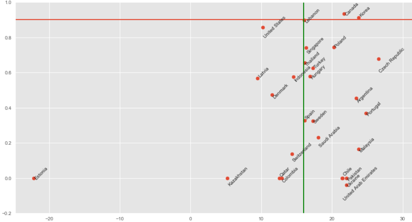
Here the green line indicates the average operating margin, whilst the red line sets a tax elasticity of 0.9, i.e., the effective tax rate is at 90% of the country headline rate. The plotted graph allows comparison across countries. For countries earning more than the average operating margin, but which have a very low tax elasticity, i.e., the countries in the right bottom corner, we might anticipate questions to be raised by the respective tax authorities given the information in CBCR.
In reality, this analysis initiated many internal queries on tax risks, internal data collection processes, and potential tax planning opportunities.
Conclusion
In the first year of collecting CBCR information, the above analyses do not necessarily require any complex data analytics setup. Excel with VBA could probably achieve the same results. However, going forward, there are inevitable scenarios where Excel would not be a good fit:
- Increasingly complex computations with increasingly large datasets
- Need to integrate with third-party data to augment tax models
- Requirement for faster models and robust codebases that adhere to software development best practices, e.g. an automated data pipeline for CI/CD and version control for audit purposes
For recurring compliance and analytic requirements such as CBCR, setting up an end-to-end solution from data extraction to deep-dive analysis is both desirable and necessary.